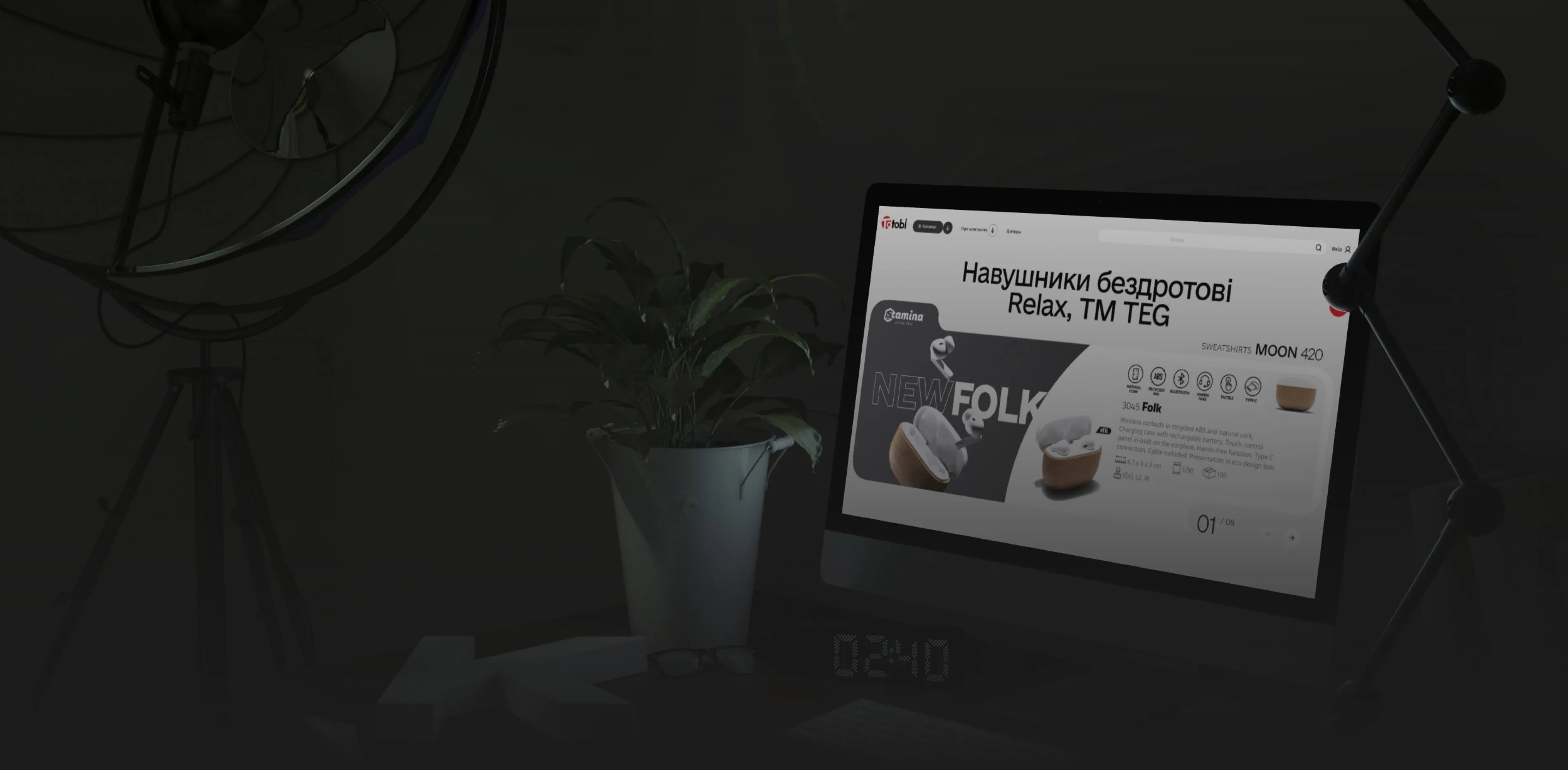
Web design is the process of creating and formatting websites that combines aesthetic and functional aspects to ensure effective user interaction. It encompasses visual elements such as colors, fonts, graphics, as well as the structure and organization of content.
Contents
- Web design: what it is and why it is important in the modern world
- Key principles of web design
- What is UX/UI design
- What is a website layout: Its role in the website development process
- Essential web design tools
- Why a website redesign is needed
- Website layout - what it is and what types exist
- What is responsive layout and why is it important
- Key trends in web design
- Web design services by Restudio
What is web design and why is it important in the modern world?
Website web design is primarily created with the needs and convenience of the consumer in mind, rather than the personal preferences of the client. User orientation allows for the creation of an effective and user-friendly resource that meets audience expectations and enhances the user experience.
A well-thought-out website design improves user experience (UX), making navigation intuitive and enjoyable, which in turn increases the time spent on the site and reduces the bounce rate.
Therefore, the main criteria we recommend considering when creating web design to keep the site attractive and effective are:
- Usability - The structure of your site should be logical and clear so that clients can find the information they need without unnecessary effort. The site should display correctly on all types of devices — from smartphones to computers.
- Visual appeal - The use of consistent color schemes, aesthetic fonts, graphic elements, and high-quality images to create a harmonious look for the site.
What are the key principles of web design?
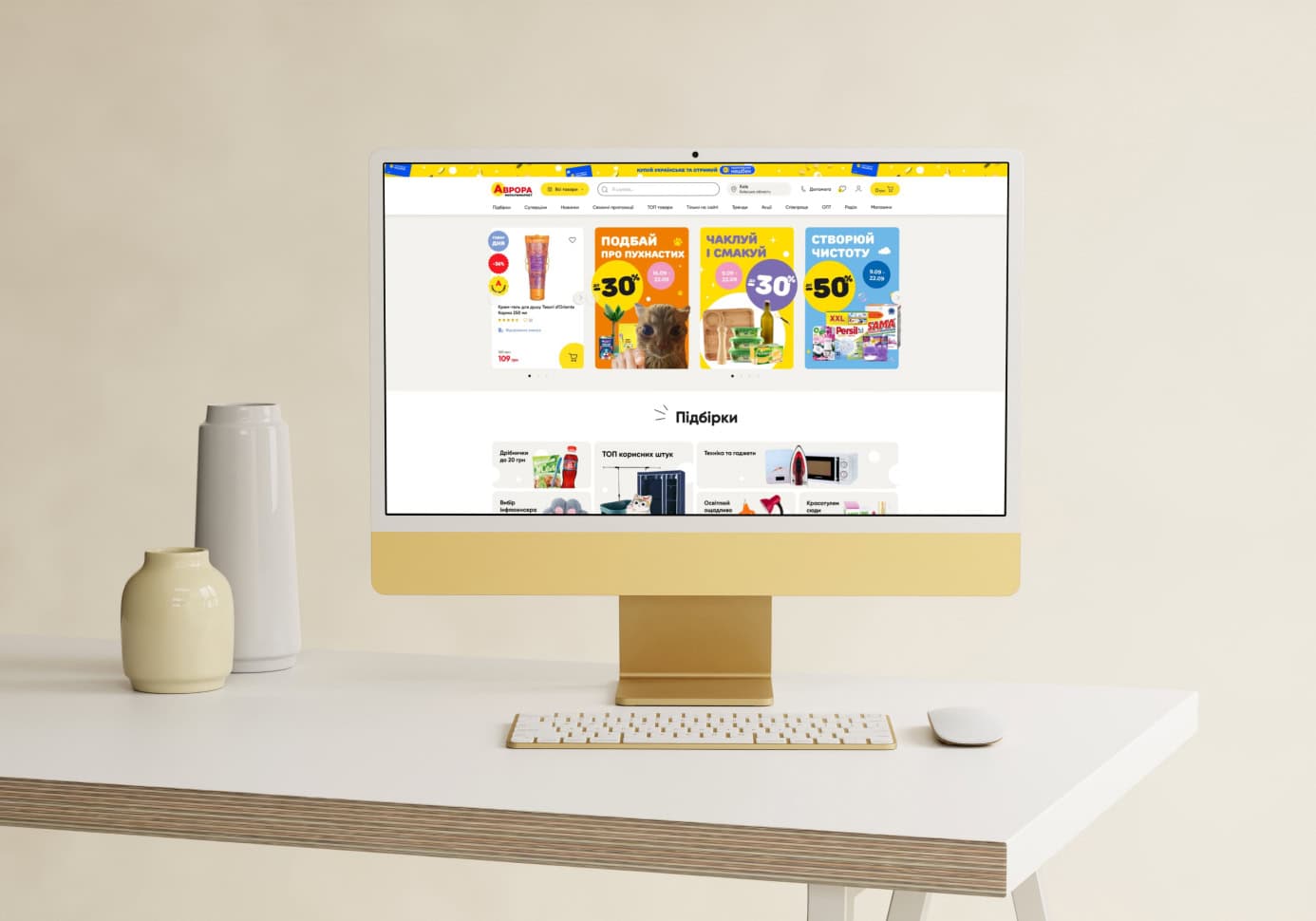
The key principles of web design help create thoughtful and aesthetically pleasing websites. They ensure that visitors have easy access to information and enhance interaction with the site, which, in turn, increases their satisfaction.
The most important of these principles that define successful web design are:
- Simplicity
A minimalist design that focuses on important elements without unnecessary details. - Responsiveness
Correct display on different devices and screens. - Consistency
Unity of style in colors, fonts, and graphics throughout the site. Consistent placement of navigation elements and content across different pages. - Typography
The use of appealing fonts with sufficient size and contrast. - Purposefulness
A design that aligns with both business goals and consumer needs. - Visually intuitive navigation
Highlighting important parts of the content through size, color, and placement of elements. Intuitive menus and easily accessible links. - Interactivity
Clear indicators for actions, such as a button color change on hover or confirmation of completed actions. Engaging users through animations, tooltips, and other interactive elements. - Testing
Using A/B testing and analytics to improve UX. - Loading speed
Optimizing graphics and code for fast site performance. - User-friendly
A design that is easy for users to understand and use.
What is UX/UI design and what is the difference between them?
UX/UI design is an important component of the process of creating digital products that provide users with an effective and convenient experience when interacting with the product.
UX design focuses on functionality and ease of use, while UI design emphasizes visual presentation and interface. Together, they create cohesive solutions that meet user requirements and enhance satisfaction with the product.
UX Design (User Experience Design)
UX design is the process of creating products that provide a positive and convenient experience for users. It focuses on all aspects of the user's interaction with the product, including its functionality, usability, and accessibility.
The main goal of UX design is to make the product intuitive and useful for the end consumer.
The key elements of UX design include:
- Information Architecture: The organization and structure of content to facilitate navigation.
- Prototyping: Creating models of the product that show how it will work.
- Testing: Evaluating prototypes or finished products to identify design issues.
- User Research: Studying user needs, behaviors, and problems through surveys, observations, and analytics.
- User Journey Visualization: Journey maps that demonstrate how users interact with the product from start to finish.
UI Design (User Interface Design)
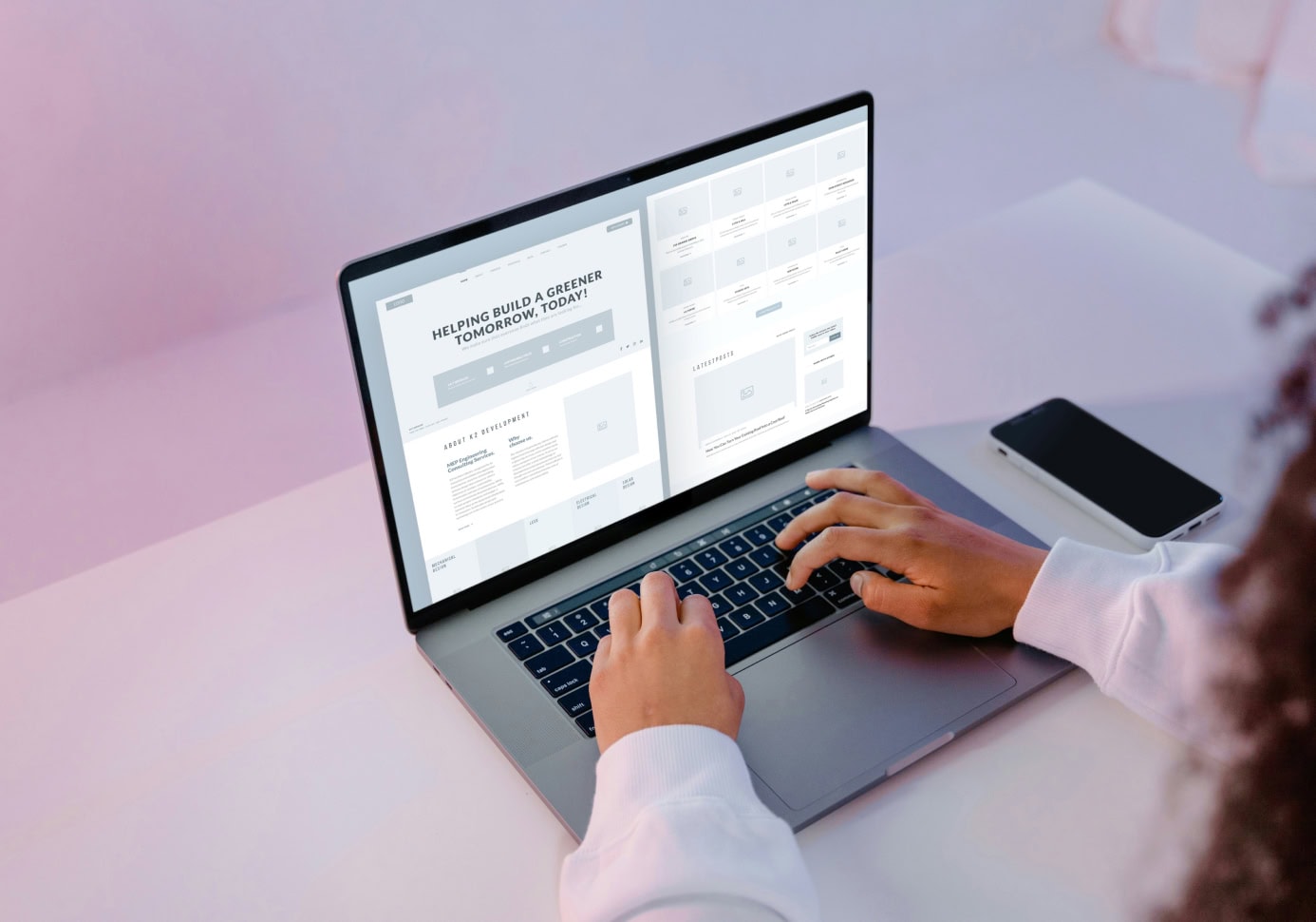
UI design is the process of creating visual elements of the interface, such as buttons, icons, typography, and colors, that provide an attractive appearance and ease of interaction with the platform.
The main goal of UI design is to create a product that is visually appealing and easy to understand so that website visitors can intuitively know how to use it.
The key elements of UI design include:
- Typography: The selection of fonts and styles to ensure readability of information and brand recognition.
- Color Palette: The use of colors to create atmosphere and emotional response.
- Graphic Elements: Icons, images, and animations that enhance visual perception.
- Interface Standardization: The use of standard elements to facilitate understanding for users.
- Visual Hierarchy: The arrangement of elements in a certain order to emphasize important parts of the interface.
Difference Between UX and UI Design
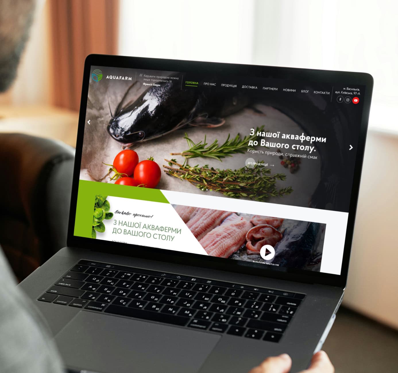
- Focus: UX design focuses on the user's experience: how the product works, what problems it solves, and how user-friendly it is. UI design emphasizes the visual aspects: how the product looks, what colors and fonts are used, and how interface elements are organized.
- Process: UX design involves research, analysis, and testing to understand user needs and create an intuitive product. UI design includes developing visual layouts, creating styles, and graphic elements that make the product appealing.
- Outcome: UX design aims to improve the functionality and usability of the product. UI design is oriented toward creating an aesthetically pleasing and visually understandable product.
Interaction Between UX and UI Design
- Collaboration: UX and UI designers work together to ensure that the product not only looks good but also functions effectively. UX design forms the foundation and structure, while UI design adds visual appeal and interactivity.
- Synergy: The merging of UX and UI design allows for the creation of products that meet user expectations, providing both functionality and aesthetics.
What is a website layout: Its role in the web development process
A website layout is a visual representation of the structure and design of web pages. It is created before the programming phase and shows the arrangement of key elements such as headers, text blocks, images, buttons, and menus. The layout allows designers to visualize and test different design concepts before they are implemented.
The role of a layout in the development process:
- Visualization of ideas: A layout helps designers and developers see how the site will look and ensures that all elements are harmoniously combined.
- Client communication: Layouts allow clients to see and approve the design before technical implementation begins, reducing misunderstandings and saving time and resources.
- Structure planning: They show how information will be organized on the pages, providing a logical and understandable navigation path for users.
- UX/UI testing: At the layout stage, different options for the arrangement of elements and interface can be tested to find the most effective solution.
- Documentation for developers: Layouts serve as a guide for developers, showing which elements need to be created and how they should appear.
What are the main stages of developing a website layout?
If you need to develop website layouts, there are key stages in the design process that help create an effective and user-friendly design.
Research and analysis:
- Studying client needs and target audience.
- Analyzing competitors and market trends.
Wireframe creation:
- Developing basic page schemes without details.
- Determining the placement of main elements.
Prototype development:
- Creating an interactive prototype to test navigation and functionality.
- Making adjustments based on feedback.
Layout design:
- Developing the visual style: choosing colors, fonts, and graphic elements.
- Creating detailed layouts of all website pages.
Testing and adjustments:
- Checking the design for compliance with requirements and usability.
- Making necessary changes and refinements.
Preparation for coding:
- Exporting graphic elements and creating technical documentation for developers.
- Passing the layout to the development team for implementation.
What are the main tools for web design?
Website layouts and prototypes are usually created using specialized web design tools. Let's take a look at the most popular ones.
Figma
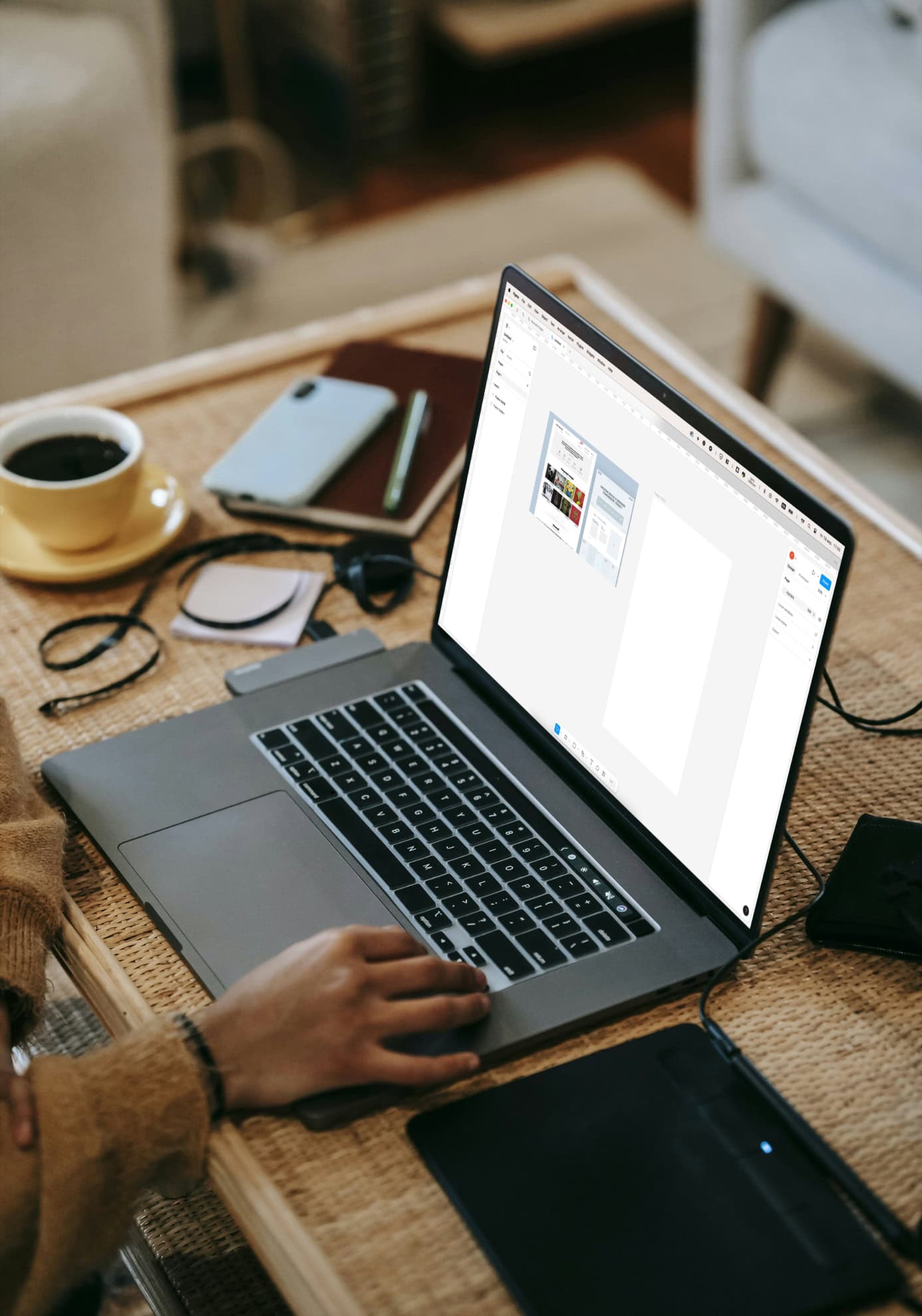
It is one of the top options. Figma allows designers to create visual prototypes of web pages that can be easily edited and tested. Figma supports real-time collaboration, enabling designers to work on a project simultaneously.
It also provides capabilities for creating interactive prototypes, testing UX/UI, and receiving feedback from clients. Using Figma significantly simplifies the process of creating website layouts, ensuring quick and effective implementation of ideas.
Adobe XD
Adobe XD is a powerful design and prototyping tool that offers interactive capabilities and easy integration with other Adobe products. It allows you to create high-quality prototypes and layouts for web pages and mobile applications, testing their functionality before implementation.
It also supports real-time team collaboration and integrates with various platforms and products, such as Photoshop and Illustrator. With automation features like repeat grids and automatic placement, Adobe XD streamlines the design process, while built-in mobile testing ensures accurate replication of the user experience.
InVision
It is used to create interactive prototypes. It allows designers to turn static layouts into live prototypes with realistic transitions and interactive elements, helping to better visualize the final product. InVision supports integration with Sketch, Adobe XD, and Photoshop, allowing easy import and synchronization of work files. The tool also provides a convenient way to share prototypes with teams and clients, gathering feedback in real time, making the design process more efficient.
Marvel
Marvel is a tool that allows you to create interactive prototypes, layouts, and user-friendly visual concepts for websites and mobile applications. It provides an intuitive interface for quickly creating prototypes that include transitions, animations, and interactive elements.
Marvel supports collaboration, allowing designers, developers, and clients to work on a project simultaneously, ensuring convenient feedback exchange. Integration with popular tools like Sketch and Photoshop allows easy import of existing designs and improvements in Marvel, making it a versatile and powerful tool for designers.
Sketch
Sketch is a widely used interface design tool, popular among designers working on Mac. It offers a clear interface and powerful tools for creating vector graphics and user interfaces.
Sketch supports many plugins that expand its functionality, allowing for the automation of routine tasks, integration with other design and development tools, and increased work productivity. Additionally, it provides capabilities for creating and sharing prototypes, facilitating effective collaboration in teams and ensuring a smooth process from concept creation to the realization of the final product.
Thus, we briefly reviewed the most popular web design tools, each offering unique capabilities for creating prototypes, layouts, and effective collaboration.
Moreover, there are many other tools that specialize in animation, image editing, and working with fonts and icons. These tools help designers realize their ideas, improve the user experience, and create attractive and functional websites.
What is website redesign and why do you need it?
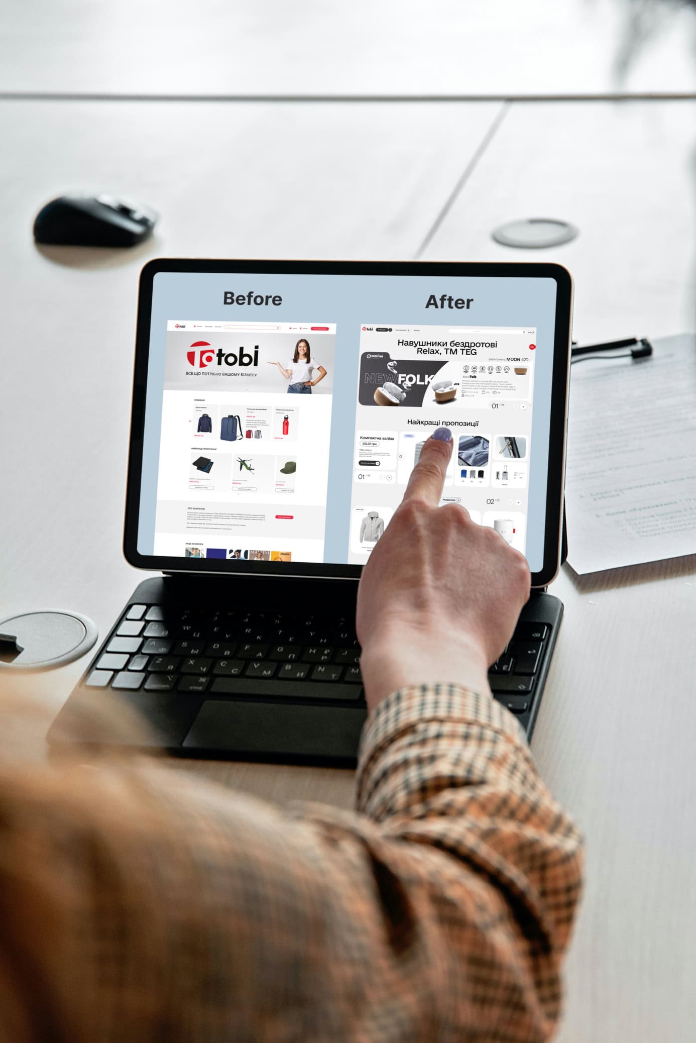
Website redesign is the process of updating the appearance, structure, and functionality of a website. It includes changes to the visual style, navigation, content, and technical aspects. Redesign can range from minor style changes to a complete overhaul of all pages and functionalities.
Can the layout and template of a site be changed?
Yes, the layout and template of a site can be changed, and this is often a key part of the redesign process. Changing the layout involves rearranging elements on the page, improving navigation, and optimizing the content structure for better usability. The site template can be modified to provide a new, modern look and align with the latest web design trends.
Why is website redesign necessary?
- Outdated design: Consumers expect a modern-looking site. If your website's design appears too outdated, it can negatively affect brand perception.
- Improving user experience (UX): Redesign allows for addressing navigation issues, making the site more intuitive and easy to use.
- Changes in business: If a company changes its brand, products, or strategy, a redesign will help reflect those changes and keep the content relevant.
- Responsiveness: Modern web resources must be easy to view on various devices, including smartphones and tablets. Redesign allows for making the site responsive, improving its accessibility.
- Compliance with new technologies: Web technologies are constantly evolving, and redesign allows for implementing new features and standards.
Overall, website redesign is an investment in the future of your online presence, which can ultimately lead to increased traffic, improved conversions, and greater user satisfaction with your resource.
What is website layout and what types are there?
Website layout is the process of converting the design of a web page mockup into code that allows browsers to properly display this layout on users' screens. It includes creating HTML code for content structure, CSS for styling, and JavaScript for interactive elements.
The goal of layout is to ensure the correct display of all site elements according to the design, regardless of the type of device or screen size.
What are the common mistakes in designing and laying out web pages?
These can include:
- Lack of responsive design, leading to incorrect display on mobile devices;
- Ignoring testing on different browsers, which can result in the site displaying incorrectly for some users;
- Improper use of HTML and CSS, complicating maintenance and causing compatibility issues;
- Ineffective image optimization, which slows down page loading.

Web Page Layout: What Are the Different Types?
1. Static Layout
This type of layout involves creating separate HTML files for each page of the website. It is suitable for small projects where content changes are rare. Key characteristics:
- Each page has its own HTML file.
- Simple implementation and development.
- Less load on the server.
- Limited functionality and difficulty in scaling and updating content.
2. Dynamic Layout
Dynamic layout uses server-side scripts to generate HTML code based on data from a database. It allows for easy content updates and provides interactivity for the site. Key characteristics:
- Use of a CMS for content management.
- Ease of editing and updating content.
- Ability to create personalized content.
- More load on the server and complexity of implementation.
3. Responsive Layout
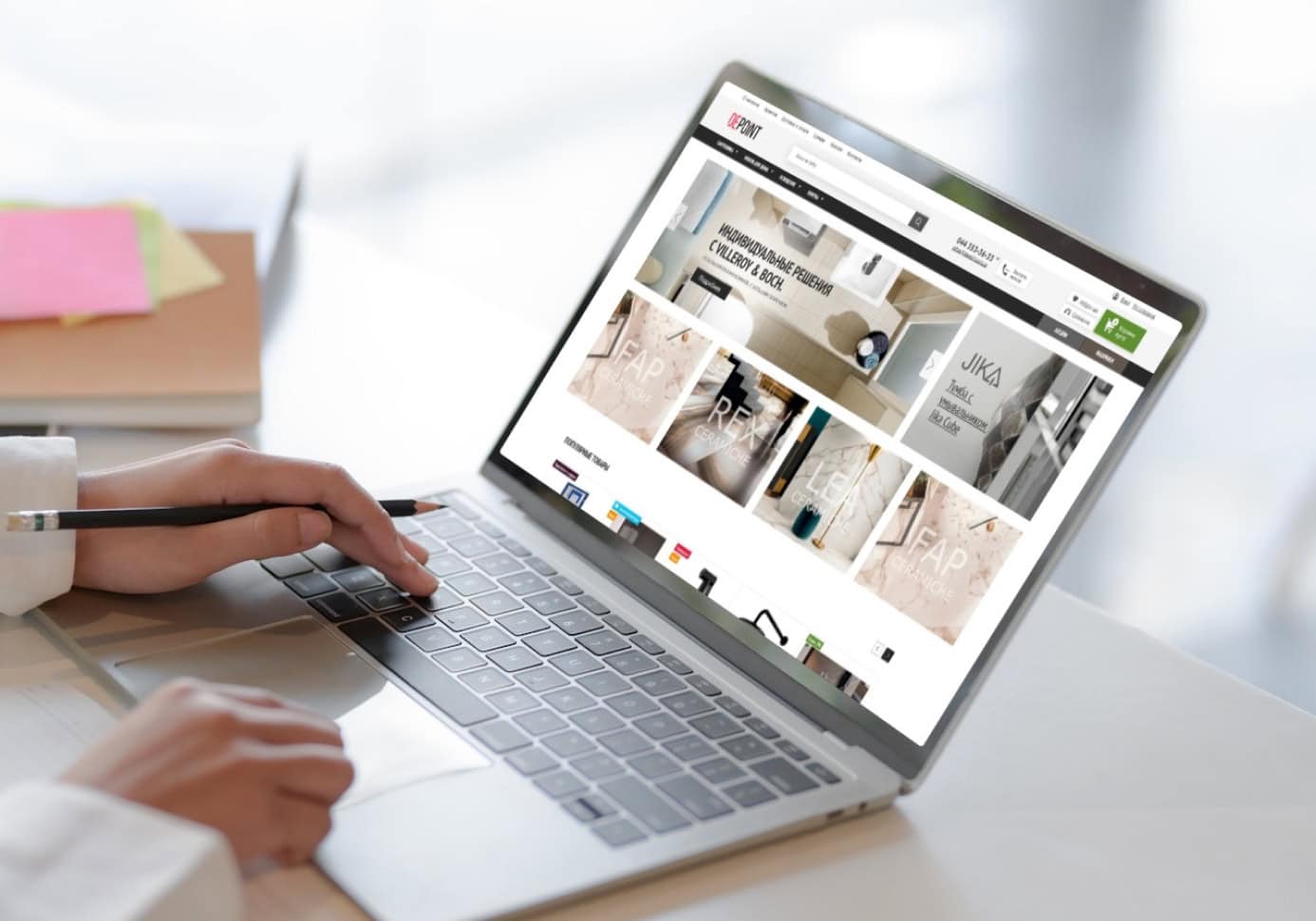
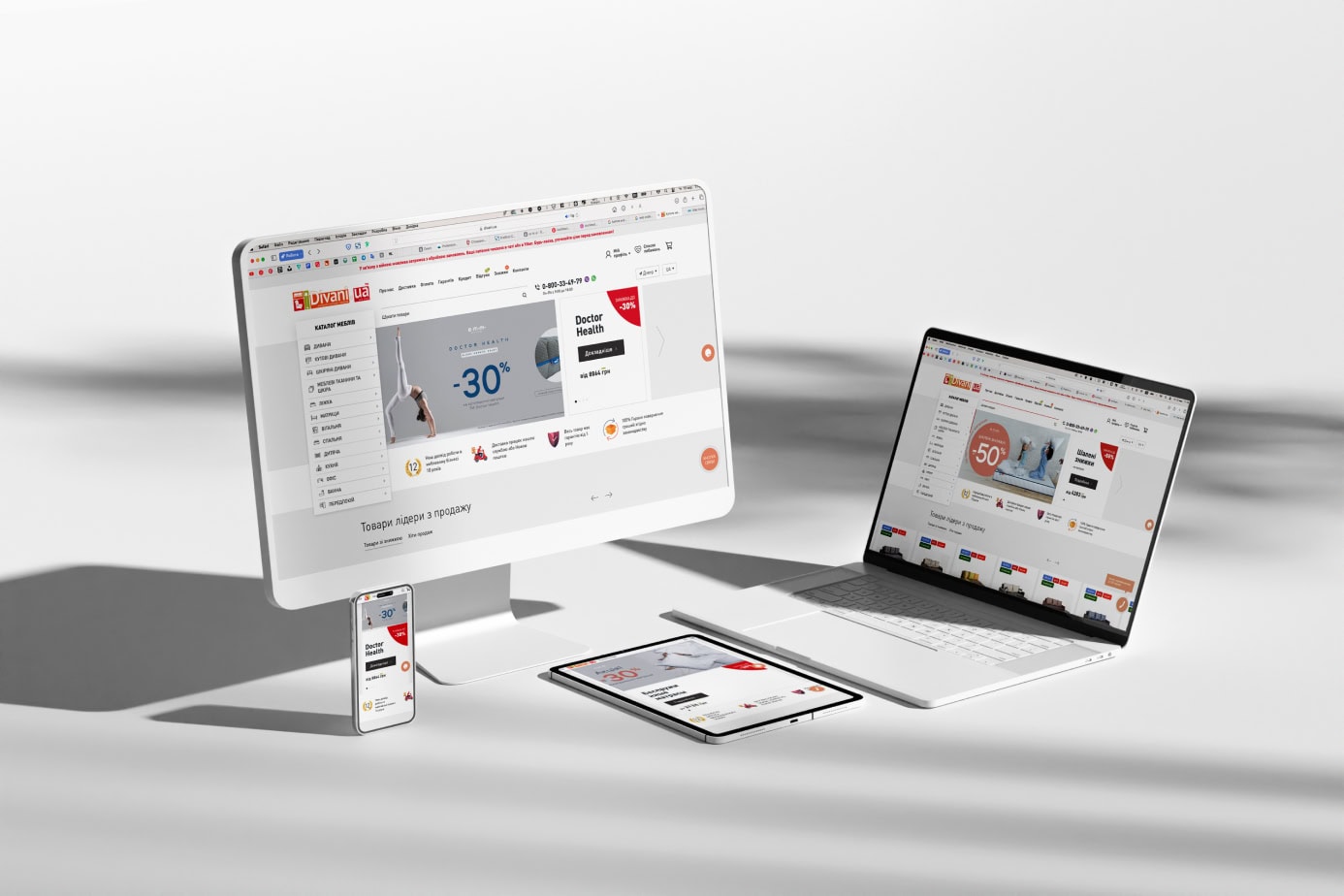
Responsive layout is an approach to creating web pages that ensures their proper display on different devices and screens, regardless of size.
This is achieved through the use of flexible grids, flexible images, and media queries in CSS.
Key characteristics:
- Flexibility of layout: Using percentage values for element sizes allows them to change according to the screen size.
- Media queries: CSS rules that apply based on device characteristics (screen size, resolution).
- Flexible images: Images that adjust their sizes according to the container they are in.
- Mobile optimization: Ensuring convenient site usage on mobile devices, including navigation and reading content.
Why Responsive Layout is Important
The responsiveness of a website is a necessary characteristic that enhances user experience, making the site convenient and accessible for all visitors, regardless of the device being used.
As of 2024, approximately 55-60% of users access websites from mobile devices.
This figure may vary, but overall mobile traffic continues to grow, making mobile optimization critically important.
Advantages of Responsive Layout:
- Improved user experience: Users can comfortably browse the site on any device without the need for scaling or horizontal scrolling.
- SEO benefits: Search engines favor websites with responsive design, improving their ranking in search results.
- Time and resource savings: One universal design for all devices instead of developing separate versions for mobile and desktop.
- Future-proofing: Responsive design is better suited for devices with different screen sizes that may emerge in the future.
Therefore, website layout is a very important stage in creating web resources, determining their functionality, accessibility, and attractiveness to users.
Utilizing various approaches to layout, including responsive design, allows for the creation of modern, effective, and user-friendly web projects.
Key Trends in Web Design
In the world of web design, technologies are constantly changing, making it essential to keep up with current trends. Every year, new features emerge that help make websites more attractive, functional, and user-friendly.
The high competition in the field of web development and website design requires designers to implement the latest trends to stand out from the crowd.
However, it is important to note that a website does not have to be ultra-modern to effectively perform its functions.
A "timeless" design focused on simplicity and usability can remain relevant and harmonious regardless of changes in technology.
This approach is oriented towards creating a classic, well-thought-out interface that provides users with a comfortable experience, no matter how trends in web design change.
Let's consider the main contemporary trends in web design for 2024 that dominate today and will continue to be popular in the future.
Minimalism
Minimalistic design, which uses simple shapes, a limited color palette, and plenty of white space, remains in trend. This allows users to focus on the main content and enhances overall navigation ease.
Minimalism also contributes to faster page loading, which is important for optimization and improving user experience.
Microanimations
Microanimations are small animated elements that add interactivity and guide users on how to interact with the site. They can highlight user actions, such as button clicks or transitions between pages, making the site experience engaging and intuitive.
3D Graphics and Illustrations
The use of 3D graphics and illustrations adds dynamism to websites, captures attention, and makes projects unique. This can include interactive graphics, animations, or interface elements that respond to user actions.
Interactive Content
This can include interactive infographics and games—such content is becoming increasingly popular and not only engages users but can also collect important information about their preferences and behavior.
Voice Interface
With the development of voice assistants like Siri, Google Assistant, and Alexa, voice interfaces are becoming an important aspect of web design. Integrating voice commands allows users to interact with the site without using a keyboard or mouse, improving accessibility and convenience.
Video Content
Video is becoming one of the leading trends in web design due to its ability to capture attention and effectively convey information. Including video content on web pages adds dynamism and visual appeal, enhancing user engagement and improving their experience.
WEB DESIGN SERVICES FROM RESTUDIO: WHAT WE OFFER
We are a web design studio specializing in creating unique and effective solutions for your business. Our services include:
- Website Design:
We create visually appealing, functional, and user-friendly websites that meet modern standards, user needs, and consider the specifics of your business. - Prototype Development:
Before moving on to the final design, we create detailed prototypes that allow you to see how your site will work and make necessary adjustments at early stages. - Corporate Identity Development:
We help you create a cohesive and recognizable image for your brand by developing a corporate identity that includes a logo, typography, color palette, and other visual elements.
Our job is to create products that emphasize your brand's individuality while providing the best user experience.
Main stages of website design development that we follow:
- Requirements Gathering and Analysis
We discuss the project's goals, analyze competitors, and the target audience to identify the most effective solutions. - Prototype Development
We create a rough layout of the site to show the structure of the pages and the placement of elements, and receive your feedback. - Presentation and Approval
We present the design, make necessary adjustments. - Transfer to Development
We transfer the completed layouts to developers and collaborate with them for accurate implementation of the design. - Testing and Launch
We test the site on various devices, after which we help launch it and provide support.
